Ready to create your own brand color palette? Yay! I’m happy for you!
Welcome to the second part in the series about creating your brand color palette. I share here a step-by-step process to create a color palette for your brand’s graphics and website like a Pro and all the technical details and tools to make it happen.
If you missed the first part, where I shared about the color psychology, the meaning behind each color and 6 questions to ask yourself before choosing your brand colors – read this blog post now to learn more about how the right colors can help you connect with your audience on the emotional level.
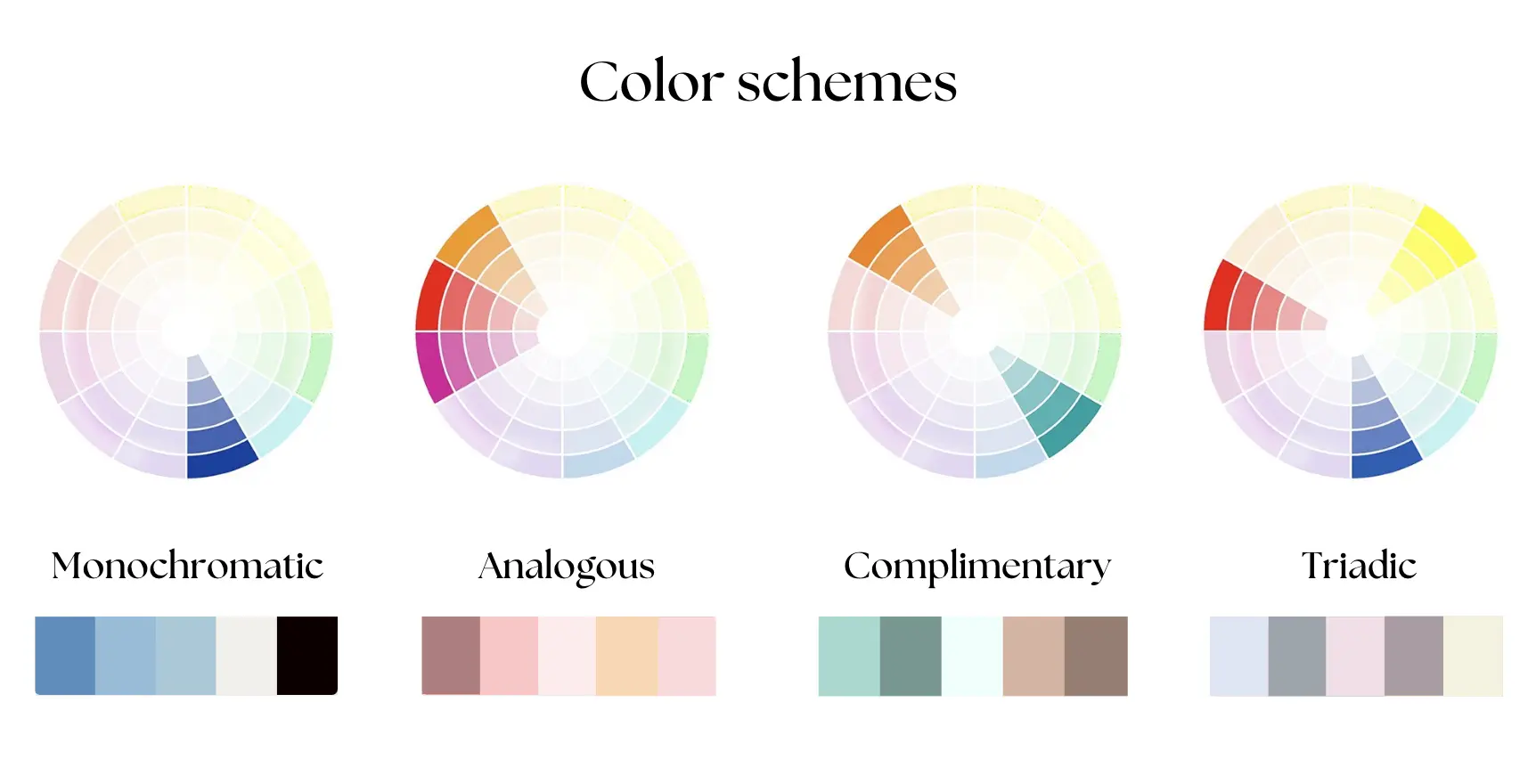
Color schemes
When you know your brand’s personality, your ideal clients and colors that would perfectly represent your brand, than it’s the right time to mix them up and create a complete color palette. But first, you need to learn about four main color schemes professional designers use in the brand color palette creation process:

1. Monochromatic – A monochromatic color scheme uses just one color in varying shades and tints. This creates a cohesive and harmonious look. It’s easy to implement and great for a clean, minimalist design.
Monochromatic schemes are perfect for creating a polished, professional appearance. But sometimes it may look boring, so I would recommend to add an accent color.
2. Analogous – An analogous color scheme includes colors that are next to each other on the color wheel. Think of hues like pink, red and orange. This scheme is naturally pleasing to the eye and creates a serene and comfortable design. It’s best for brands looking to evoke a calm and harmonious feeling.
3. Complimentary – A complementary color scheme uses colors that are opposite each other on the color wheel, like mint and orange. These contrasting colors make each other stand out, creating a vibrant and dynamic look. It’s ideal for brands wanting to grab attention and convey energy.
4. Triadic – A triadic color scheme involves three colors that are evenly spaced around the color wheel. An example is red, yellow, and blue. This scheme is balanced and offers a lot of contrast while maintaining harmony. It’s best for brands that want a colourful and energetic look without being overwhelming.
Okay, now you know the 4 types of color schemes, let’s create your own.
Step 1. Gather your Inspirations
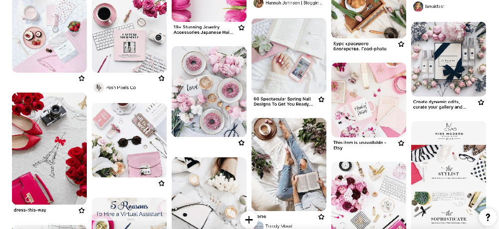
This is the most fun part. Collect 20-30 images that represent your brand. It could be anything aligned with your own business vision and values (landscape, interiors, patterns, flowers, etc). Gather your images in one place. I prefer to pin them (one board for one project). I think this website doesn’t need an introduction, but anyway:
- Pinterest – My favourite resource to search for color and design inspirations. Create a secret board and pin all images, that reflect your chosen style.

Step 2. Choose brand color palette from photos or other websites
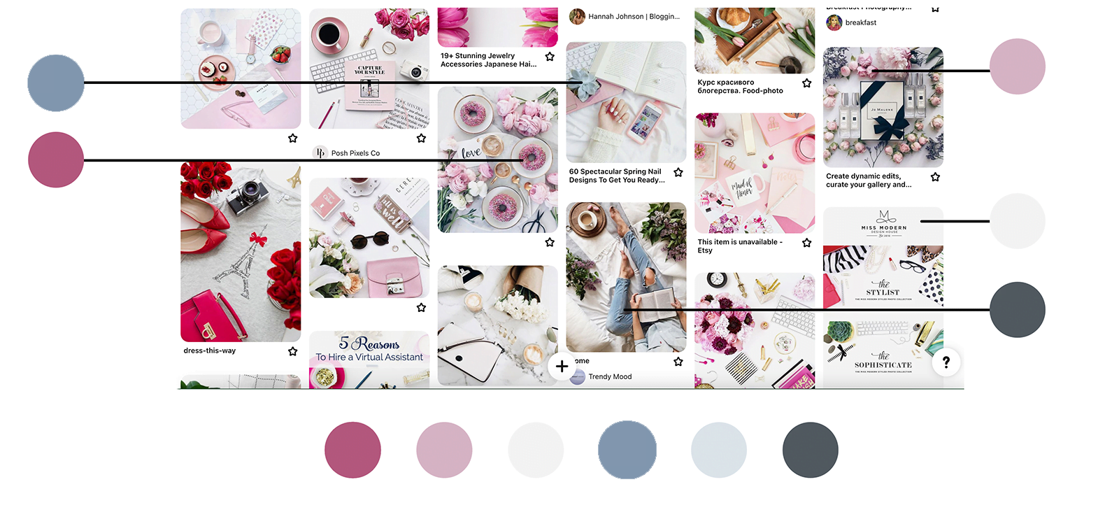
You’ve done the most of the work. Just sit back, take a minute to admire you mood board and than try to notice similar patterns, styles and colors. Ask yourself what colors are you seeing the most? What is the main and second most used colors?
Now, you need to extract those colors from your images. Try these tools:
- Coolors.co – Convenient tool that quickly extracts colors from your image. And the best part, you can adjust colors by yourself or regenerate them automatically. Screenshot your mood board and upload it to this website (go to Tools – Image Picker).
- Canva Color Palette Generator – Easy to use, automatically extracts the colors from the image to create a color combination. But you can’t adjust colors like in the tool I mentioned above.
- ColorZilla for Chrome (extension) – It’s a free Chrome browser extension. The main feature allows to pick a color from any images and backgrounds on the web pages opened in your browser (yeah, you can secretly check out your competitors HEX codes as well, but don’t recommend to copy anyone, stay true to your favourite colors).

Step 3. Refine your Brand Color Palette
When you pick the main colors from you mood board, now is the time to adjust them. The rule of thumb is to have no more than 6 colors in your color palette and stick to them in all your branding materials: logo, graphics, website, packaging, photography, etc.
Select up to 6 colors:
- 1-2 main colors
- 1-2 secondary (neutral) colors
- 1-2 accent colors
It doesn’t have to include all 6 colors, you can choose only three: 1 main, 1 secondary (neutral), 1 accent. It’s always about the balance.
The Main colors are the ones that represent your brand, and used on backgrounds, borders, buttons, in images (your wardrobe as well).
The secondary (neutral) colors are literally neutral colors that complement your main ones and often used as a background, or to brake up large areas.
The accent colors are the most vibrant in your color palette. their goal is to grab the attention. It can be used in logos, CTA buttons, etc. But be careful, don’t overuse it. The recommended proportion is up to 10%.
These websites are my favourite to adjust the colors, some of them have tons of pre-made color palettes, you can browse them for inspiration:
- Adobe Color – Advanced tool, used by many designers. Check out the Explore and Trend tabs to get color schemes inspirations, grouped by categories.
- Muzli colors – color palette generator, you can search by color and be inspired by different similar color combinations.
- Coolors.co – the same tool I mentioned in the step 2, check out the “Explore palettes” tool for more inspiration. I personally love to use “Palette generator tool to get new color combination ideas. Usually I paste one main color, lock it, press the space bar and watch for other color choices to complement the main one.
- Color Calculator – with this tool you can insert your main color and it will suggest the colors based on the color scheme (harmony) you choose (monochromatic, complimentary, analogous, etc.). I use it as an inspiration and fine tune them later.
After the refinement I ended up with this feminine gorgeous color palette

Step 4. Finalize
Before you finalize your color palette, make sure it’s aligned with your brand. Ask yourself the main question: “Will those colors appeal to my ideal client?”. You can even show them to your friends and family or someone who fit into description of your ideal client and ask them how does those colors make them feel and what associations do they have.
Extra design tips
- Create your own brand board and include the hex codes of your colors. Keep it somewhere you can easily find them.
- If you need to be extra prepared, for example outsource the design tasks to the professionals or to the print services, include the CMYK and RGB color codes. You can easily convert your hex codes into other color codes with this tool ConvertAColor.
Yay! You’ve made it! Now you have everything to make your gorgeous color palette that gonna represent your brand in the best way. You can use it not only for your graphics, but as your website color scheme as well.
I really hope this two-part blog post series was helpful for you. Missed the first one? – here it is. If you think it was valuable, I would appreciate if you share this post with your friends and fellow entrepreneurs who may benefit from it. If you have any questions or just want to say hi, let’s connect on Instagram.


