Deciding what color to choose for your brand identity, website and social media channel? That’s great!
Before you make a final decision, have you thought about the meaning of each color and how it influence your audience’s decisions to buy your offers or work with you?
In this blog post (part 1) you’ll learn about color psychology, how connected colors and emotions, how it impacts client’s behaviour and main things you need to know before you choose your brand colors. And the second post (part 2) in this series reveals all the technical steps and my favourite tools to create a brand color pallet like a Pro.
Let’s begin…
“Why should I care about the colors?”
Color is more than just a visual element. Because it’s a powerful tool that can evoke emotions, carry the messages, and shape perceptions of your business without even using the words. As a small business owners we can’t ignore the fact that color affects the sales. In fact, people’s buying decisions based 60-80% on color.
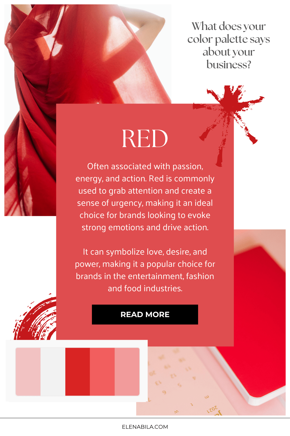
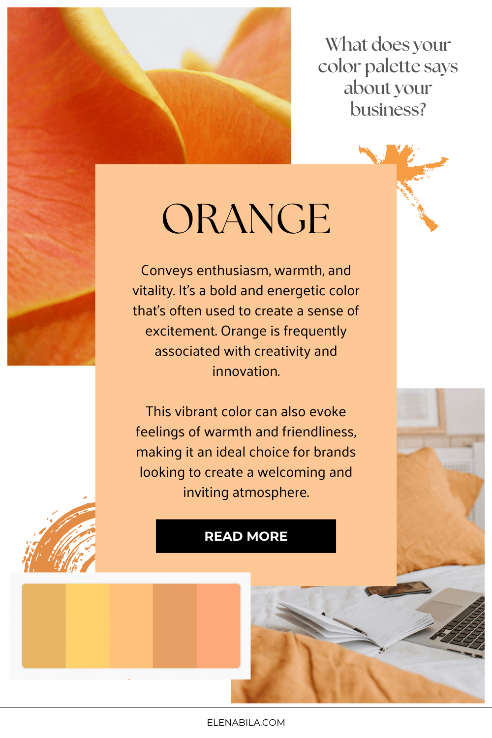
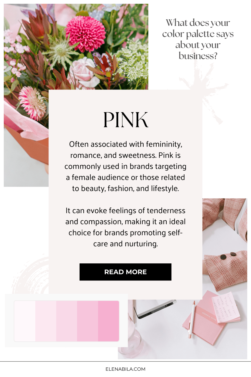
Which is why it’s so important to choose your colors wisely and make sure it communicates the message you want to share. For example, the pink (one of my brand’s color) is always associated with femininity, elegance and youthfulness.
Can you guess which brand I’m describing below?
Social media platform with a blue and white branding (Facebook). The reason most social and communication companies chose blue, because it evokes the feeling of trust and reliability.
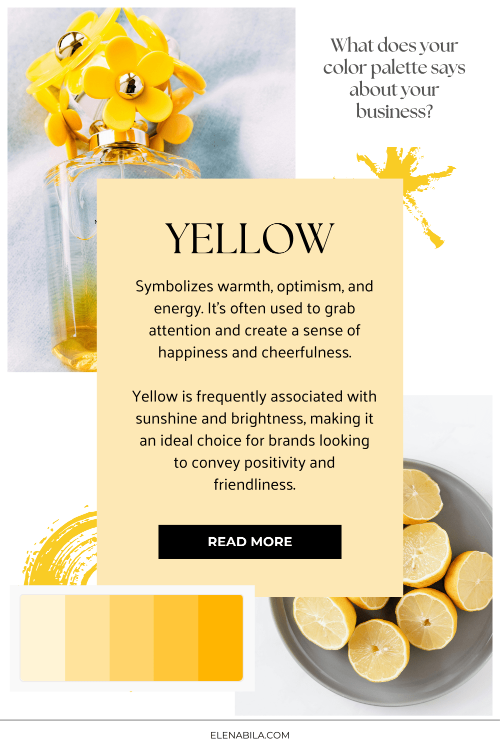
One of the biggest family oriented fast food chains with vibrant yellow color, that evokes feelings of warmth and joy. (McDonald’s). – I’m not a fan of fast food, actually I’m a happy plant based vegan. Just put it here as an example.
So brand color palette is not a random collection of colors. Big companies chose their brand colors very wisely and intentionally.
When people visit your website or social media profile, the first thing their eyes pay attention to is color.
So if you are in the process of DIY-ing your brand or already launched your business, it’s important to make sure your colors aligns with your brand strategy, personality and your ideal clients.
Top 6 questions to ask yourself before choosing your brand colors
But before you jump into picking colors, ask yourself these 6 question about your brand:
- How my friends and family describe my personality? Is it fun, friendly, reliable, empathetic, passionate?
- How would you shortly describe why did you start business (besides money)?
- How would you describe your ideal client?
- How do you want your ideal client to feel?
- What are the top 2 colors that pop up in your head when you think about your brand?
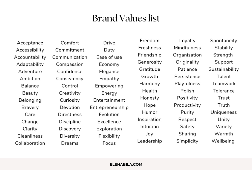
- What are the top 5 values you want to be known for? What does your brand stands for? Is it entrepreneurship, wellbeing, discipline, honesty, flexibility, etc. Here’s a value examples from my upcoming Brand Clarity workshop.
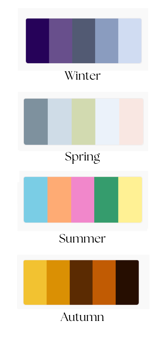
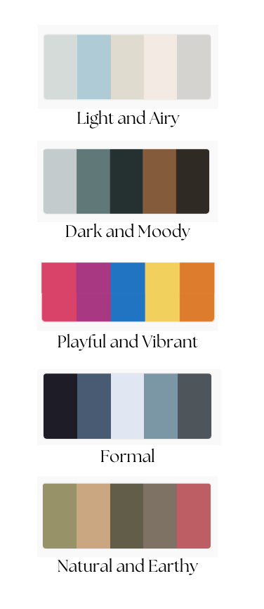
Understanding Color Psychology
Now, when you define your band adjectives, let’s take a look at the psychology behind each color.
Colors can evoke a wide range of emotions and associations. It influence our moods and shapes our perceptions.
When it comes to branding, colors are more than just visual choices – they carry meaning and emotion. The colors you choose for your brand can help shape its personality and create strong emotional connections with your audience. By picking colors that reflect your brand’s values and resonate with your ideal clients, you can reinforce your brand identity and set yourself apart from the competition.
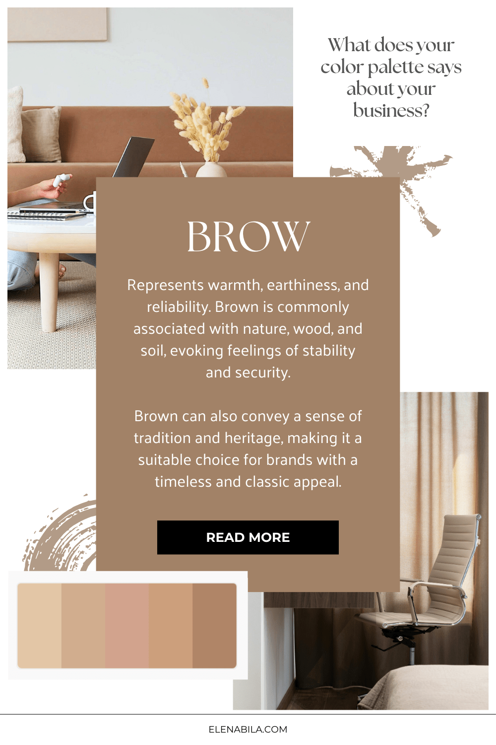
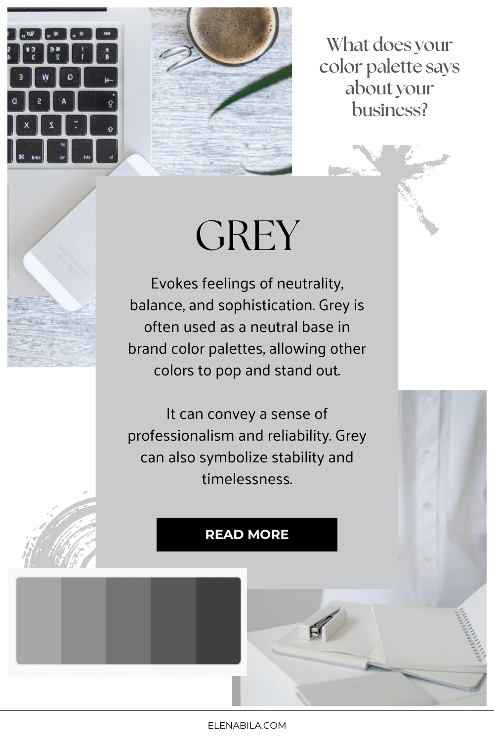
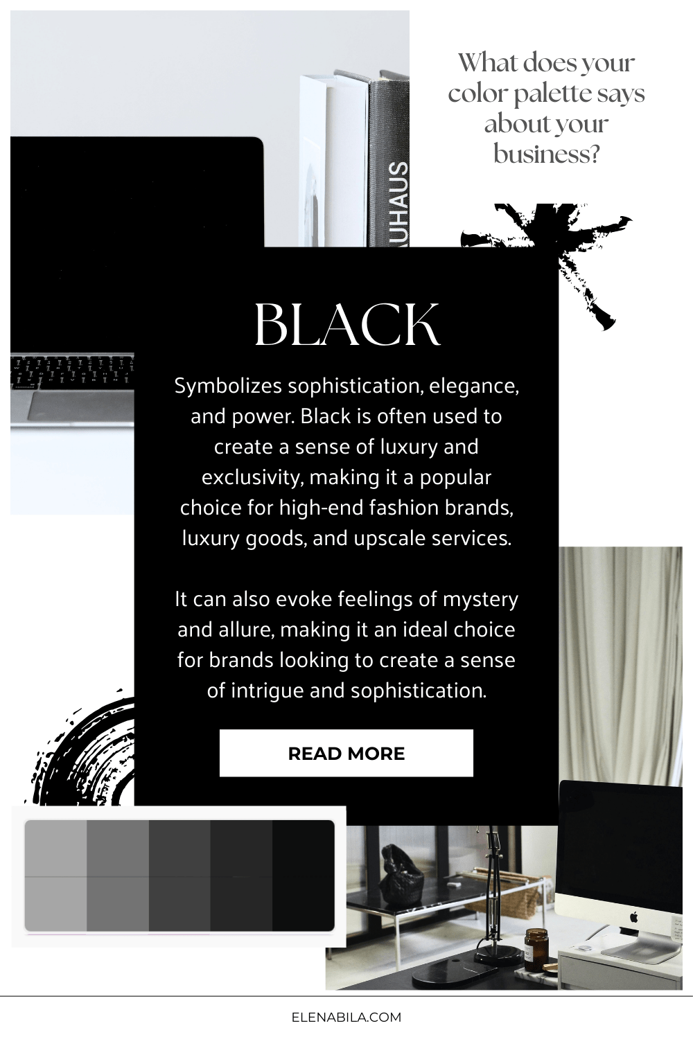
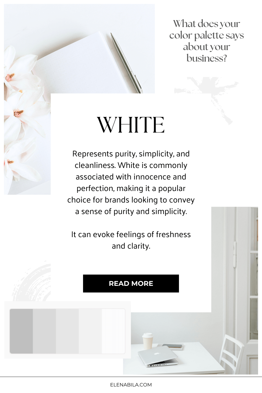
Color descriptions:
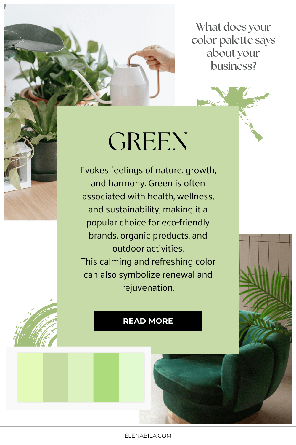
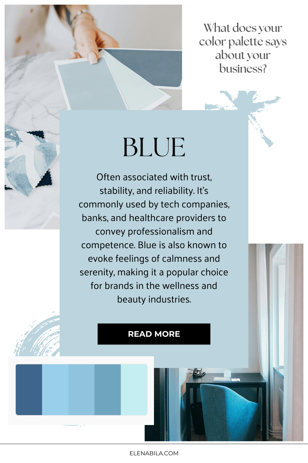
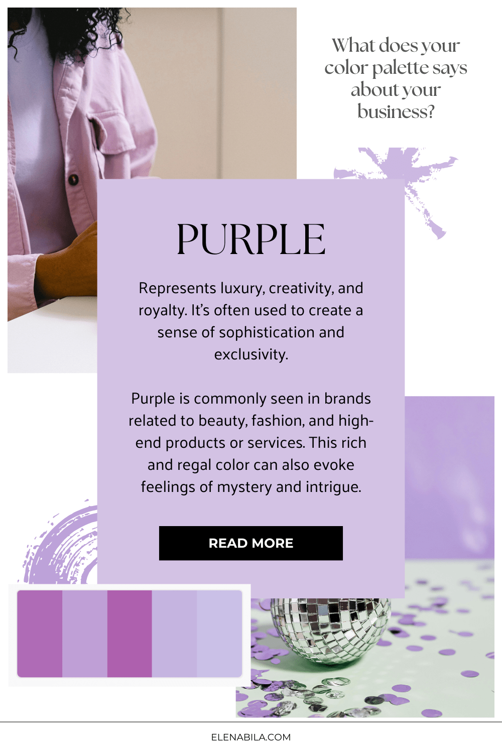
Let’s dive into brand colors meaning a little more:
Fun personal fact: I chose my main brand colors based on astrological knowledge. The dark blue represents planet Saturn and stands for competence, discipline, consistency, loyalty and reliability. And light pink represents planet Venus and stands for femininity, elegance, compassion, balance and playfulness. And my accent “orange-gold” color represents planet Jupiter – prosperity, wisdom, systems, complete bigger picture, wholeness.
Enough about me, now it’s your turn.